Microsoft Excel Explored by Aubrey
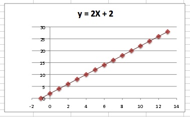
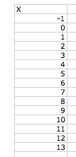
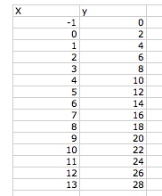
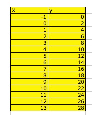
In this exploration, we will see how to create a graph and find the equation of the graph in Microsoft Excel. First I, 0 - 13, in increments of one for my X-vales and labeled the columns X.
Then I picked a starting number for my Y-values, I chose to start with 28, and then decreased the Y-values by 2 for every X value.
To create the graph I highlighted both the A and the B column and selected "charts." I chose the XY Scatter Plot.
To create the line of best fit (a straight line that best represents the data on a scatter plot, it may pass through some of the points, none of the points or all of the points. It is used to predict data that was not represented by the given data, according to regentsprep.org). I clicked on the graph to select it and then went to the toolbox and selected "Chart" then "Add Treadline." The equation is linear by default, y = mx + b, where m is the slope and b is the Y-intercept. To get the values of m and b on the graph I returned to the "Add Treadline" and checked the box to display the equation. (I made my equation the title of the graph).